The project essay must outline the following:
1. How does your design teach something about a particular segment of history and engage the audience?
2. How does your design conform to the "rule of thirds"?
3. How have the principles: emphasis, alignment, contrast, balance, flow and repetition
been implemented within your design?
4. What role does color and typography serve within your design?
I did my history project on east coast surfing it teaches the reader the basics of knowledge and facts of surfing and pictures of people showing what they got the east coast way.
My design conforms to the law of thirds by drawing the viewers eye to the top left corner then wraps down to the bottom giving the poster very good flow. i used the principe of emphasis in the text. i use the principle alignment when it comes to the information. i used the principle contrast the back ground image the the color photos.and i also used the principal repetition with my bullets.
color and typography plays a big roll in my design the type give it a post modern feel and the black and whit photo behind the color photos give it a feel that its all most two different worlds.
Thursday, December 15, 2011
Tuesday, December 13, 2011
Thursday, November 17, 2011
Thursday, November 10, 2011
Tuesday, November 1, 2011
Tuesday, October 4, 2011
Thursday, September 29, 2011
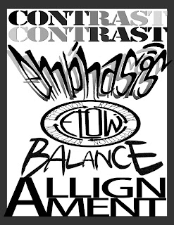
The objective of our first computer graphics project was to design an arrangement of the design principles Emphasis, Contrast, Balance, Flow, Alignment and Repetition. That creates one unified design conforming to the rule of thirds. To do this I put the principle Emphasis across the top two points of the grid to catch the viewers eye. The principle Balance I placed on the bottom right point so it’s the next place your eye will go. Then the principle Contrast is at the very bottom of the page catching your eye after Balance. Then your eye goes to the principle Alignment witch is at the top of the page. The last principles your eye goes to is Flow and Repetition And flow witch are at the bottom right point but it is dark so it is the last principles to notice. My design leads the viewers eye clock wise around the page.
I believe my design fits the objective very well. For the principle Emphasis I used a hand rendered design that I drew that I thought visually caught the viewers eye and would visually communicate the principle of emphasis. I scanned it into photoshop and edited it to fit into my design. For the principle of Contrast I decided to type the word contrast twice one on top of the other using the photoshop font stencil std because I think it really stands out. Then I used a grey scale gradient over the words going opposite directions. So dark is over light and light is over dark I thought this communicated the meaning of contrast very well because the grey scale gradient over the letters. For the principle Balance I typed the word balance and used a symmetrical design so the the outer letters B and E are the biggest and gradually got smaller as it gets closer the middle. I thought this fit the principle of Balance very well because I used symmetrical balance in the design. For the principle of Flow I used a hand rendered design that I drew it of the word flow inside of a circle of arrows I thought is was a really good way to visually communicate the message of flow because it leads your eye around the circle. For the principle of alignment I made the A big and put LLIGN on top of MENT and aligned them with the A. For the principle of Repetition I integrated it into the design of flow by putting the word Repetition on each of the four arrows around Flow.
Thursday, September 22, 2011
Subscribe to:
Comments (Atom)


